I started my research for this project with the Tony Ianzelo and Andy Thomson 1976 film about David Blackwood. The film was very interesting and informative. It also somehow lead me to John Brunsdon. There is nothing more sad than finding someone whose work you are moved by only to discover that they died six years ago!
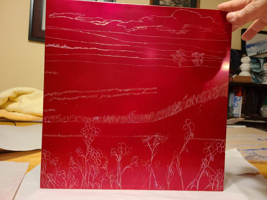
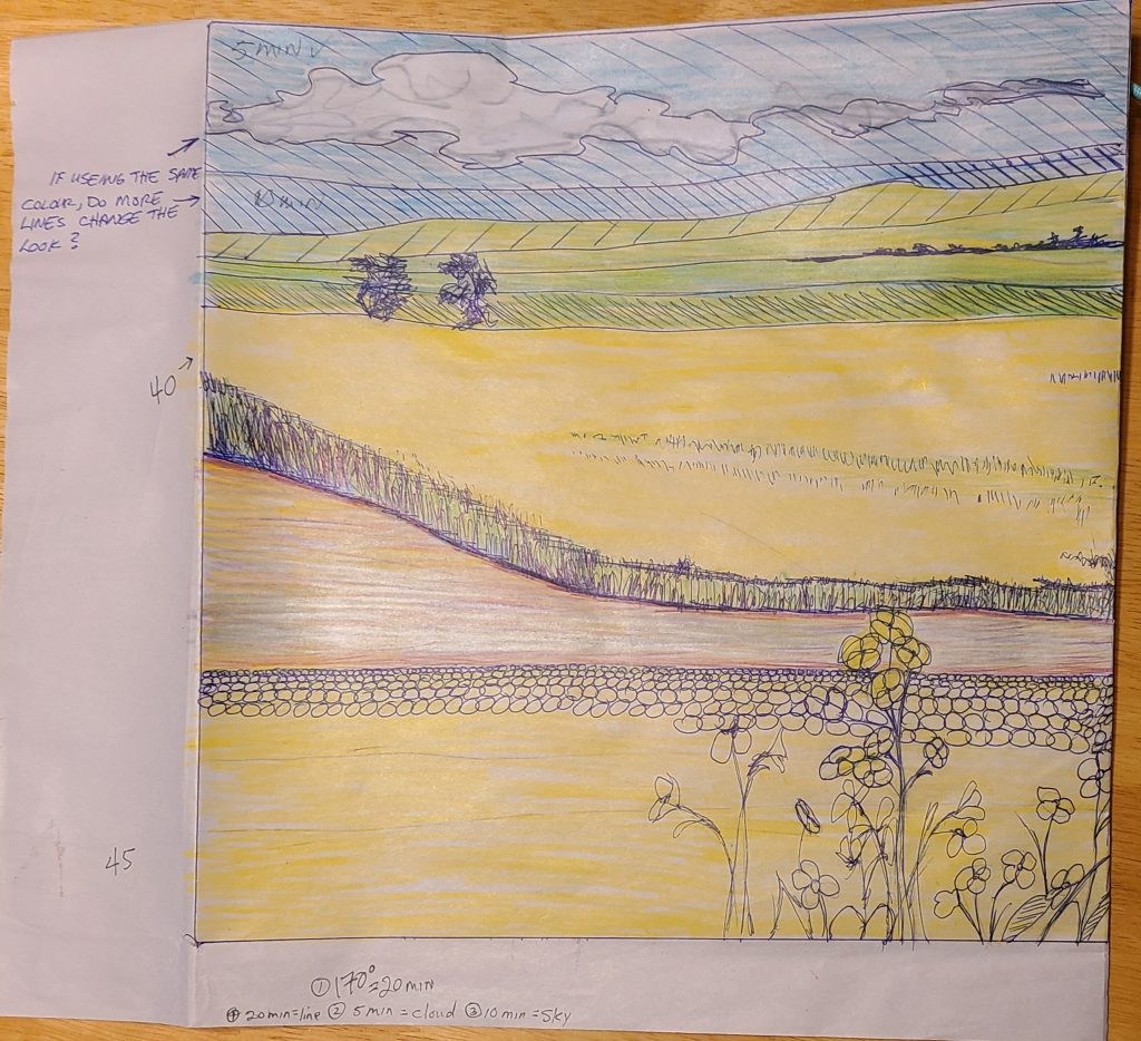
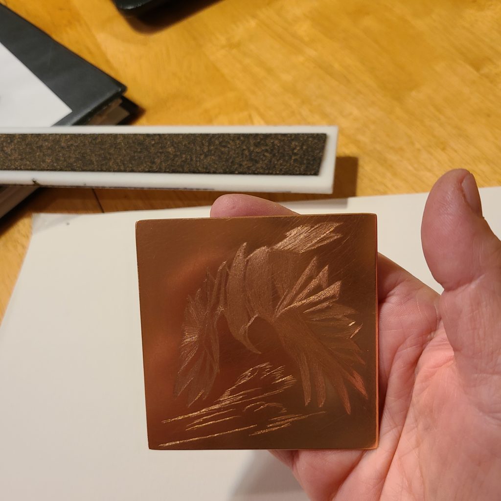
Both of these artists inspired the self-directed copper plate that I am naming Mustard Fields. I worked my plate first with Big Red to get my line etch.
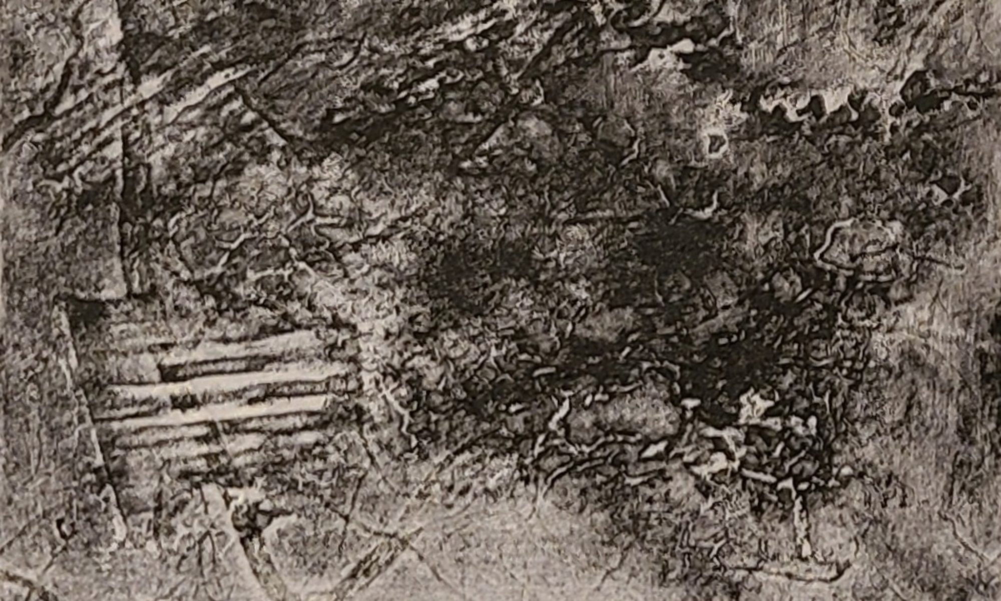
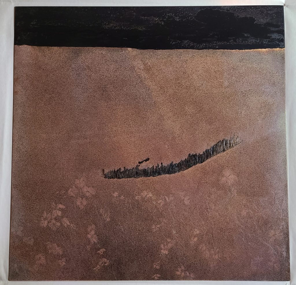
Big Red with beginning of line etchFirst test after twenty minute line etchCopper Plate after Zeamazing aquatint spray. I think I got a 50/50 blend.After using the stop out on the cloud I dipped the plate for five minutes.
I was in a hurry to dip the plate a second time before having to leave the studio, as a result I forgot to take a photo of the first five minute Stopout dip of just the cloud.
Second Stopout. The plate before its second five minute dip in the acid
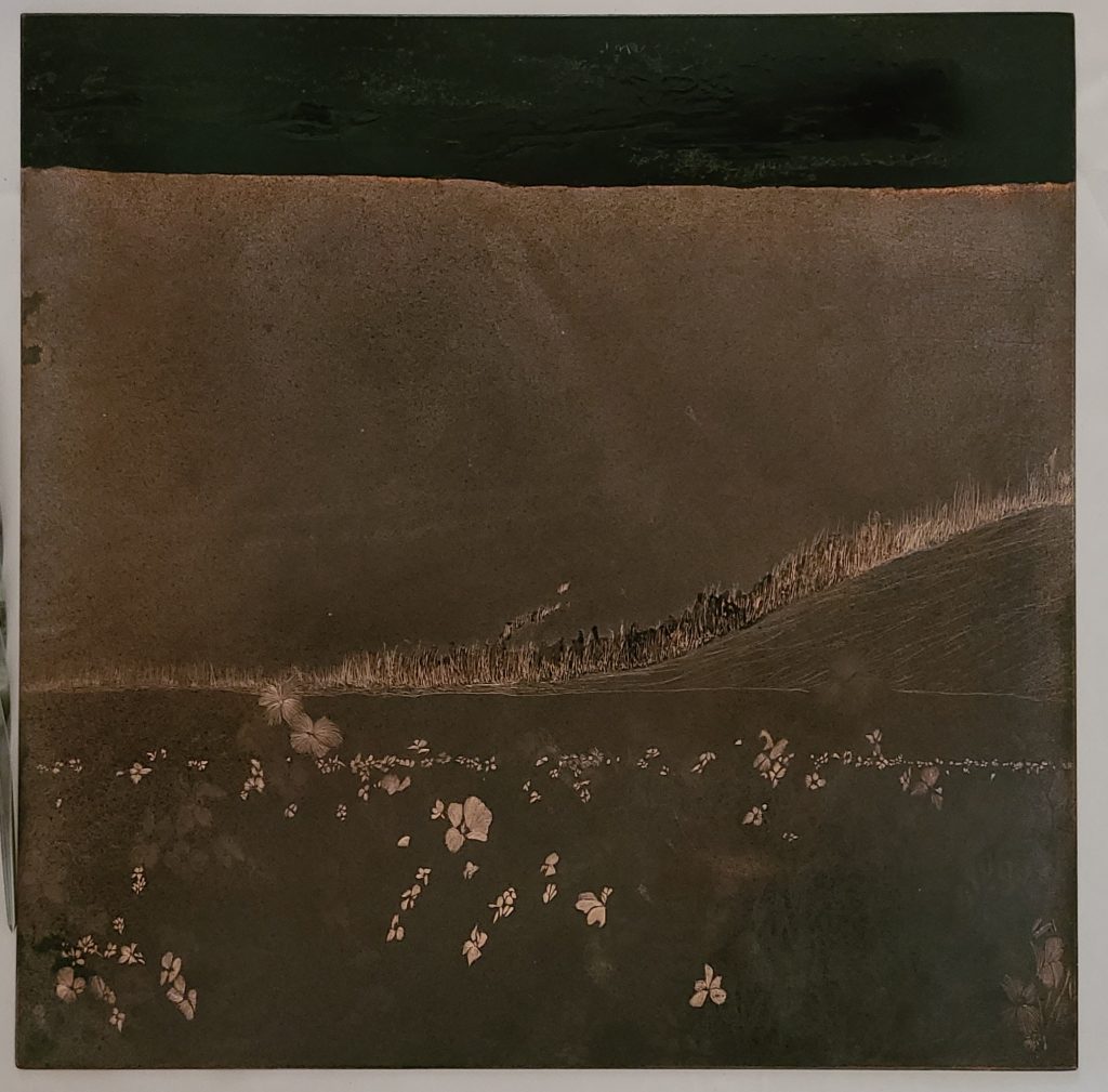
After dipping the plate for ten minutes I carved out more flowers in the foreground as well as some of the grass in the mid-ground field. I also used stop out in the clouds and sky, and middle grass line.
Again, I was in a hurry to dip before leaving the studio and failed to get a photo of the plate before its final five minute dip, in which more flowers were carved and the field just below the sky was covered with Stop Out.
Fouth Stopout. You can see in this photo that I continued to carve out various flowers with each five minute dip.
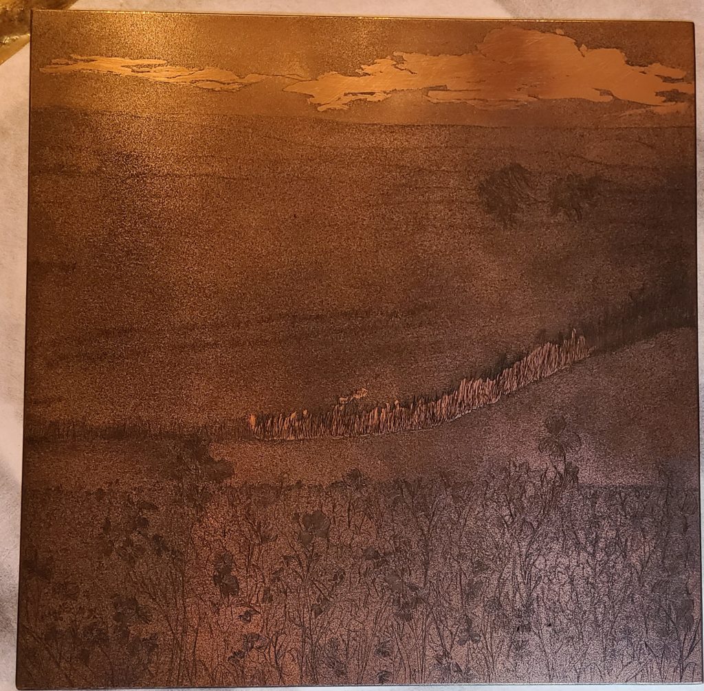
This is a photo of my plate after three separate five minute dips. It is worked again with more Stop Out in the sky, more carving of foreground flowers, as well as a mid-ground grass line. I also added some soft carved lines to separate the dirt road up into the fields. I dipped the plate one final time for five minutes.
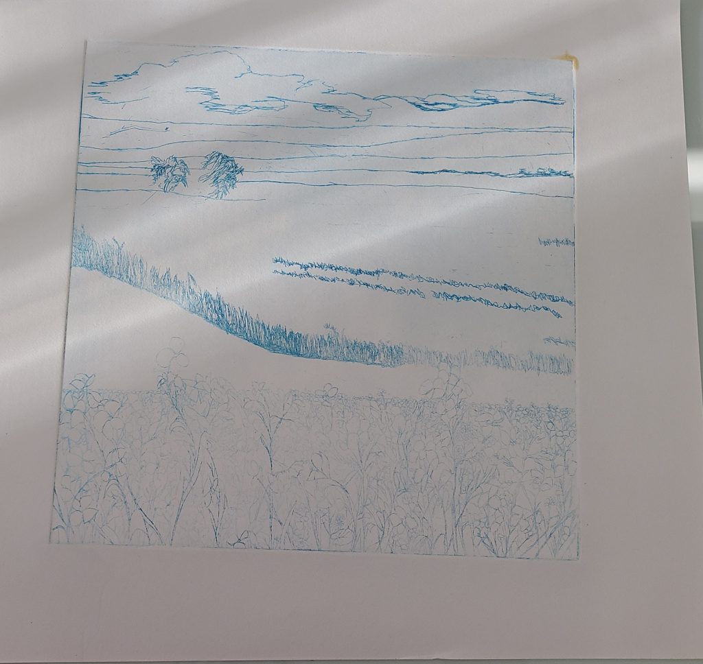
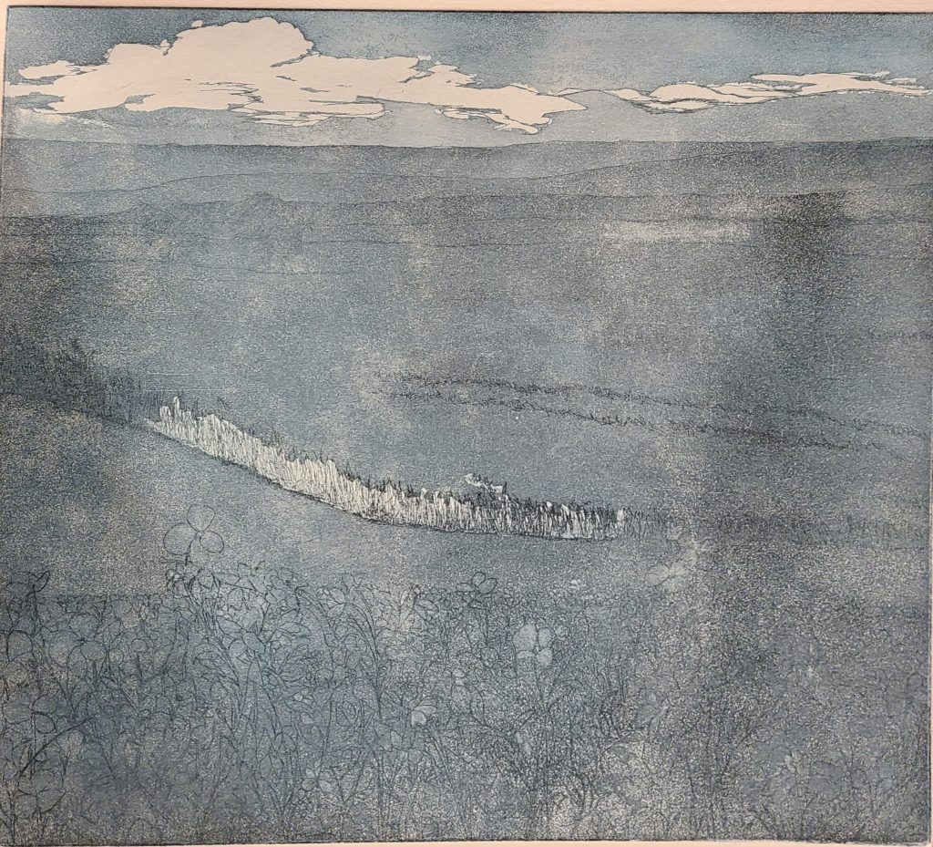
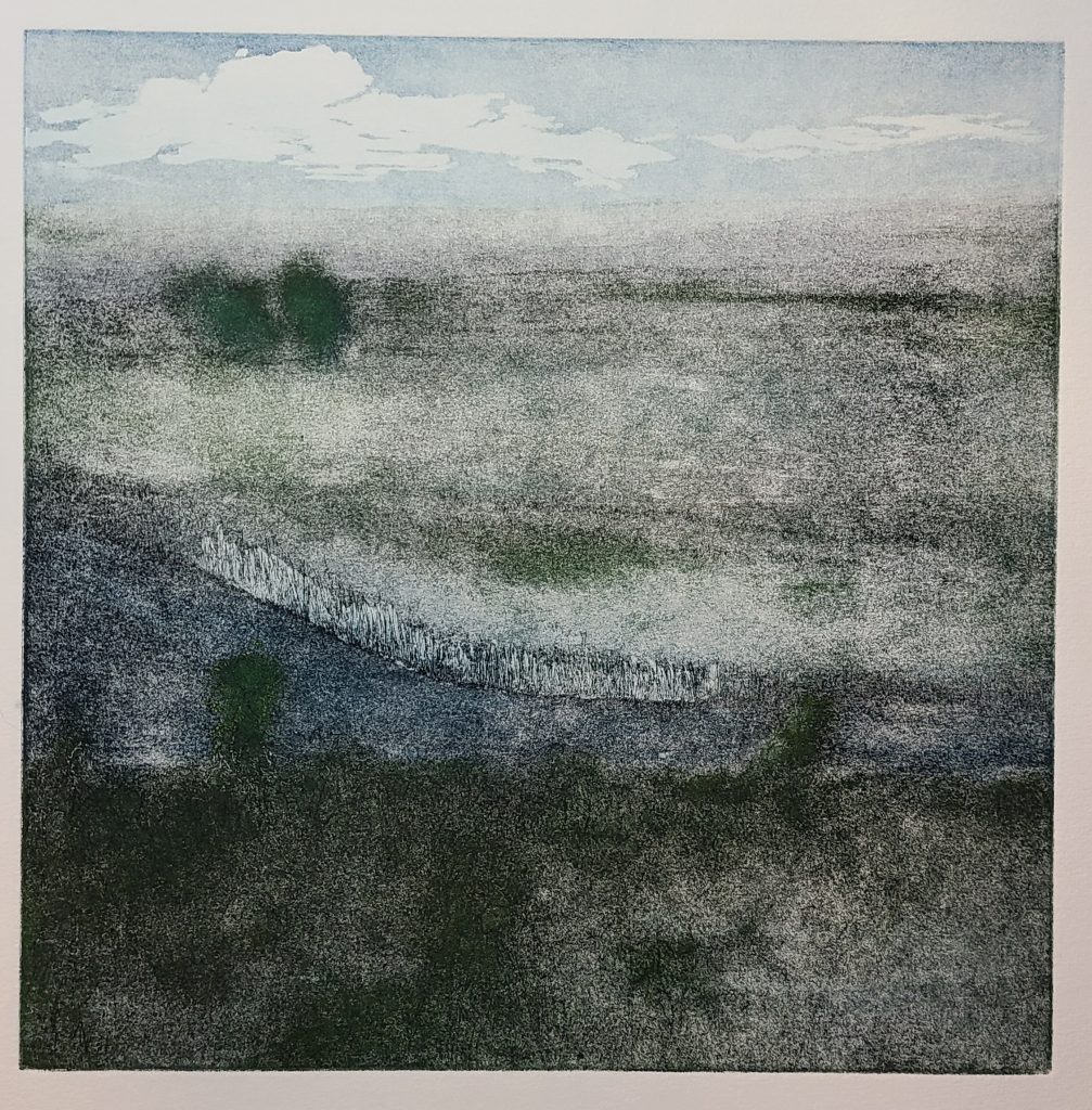
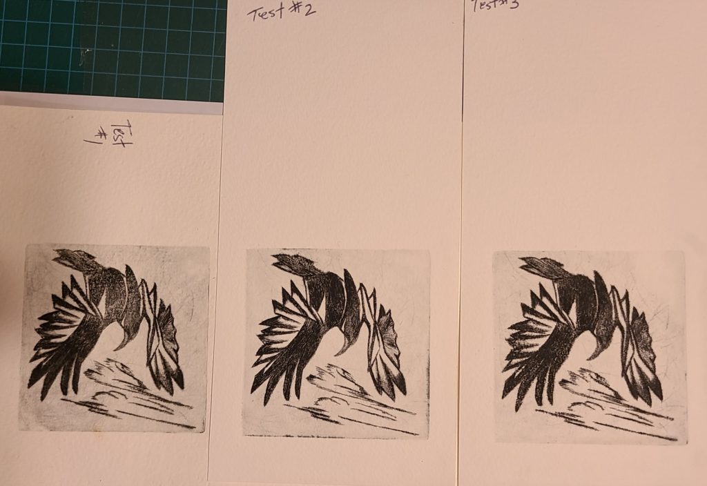
Fourth test print in studio using black cranfield ink , with a thin gray viscosity colour over the black line work
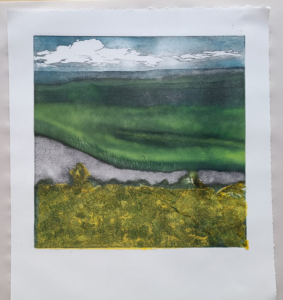
Print 1/100 is done on 140lbs wet Stonehenge paper. It has black, blue, and yellow Cranfield Ink.
This is plate 1/100. I used three A la Poupee colours as well as Chin Cole.
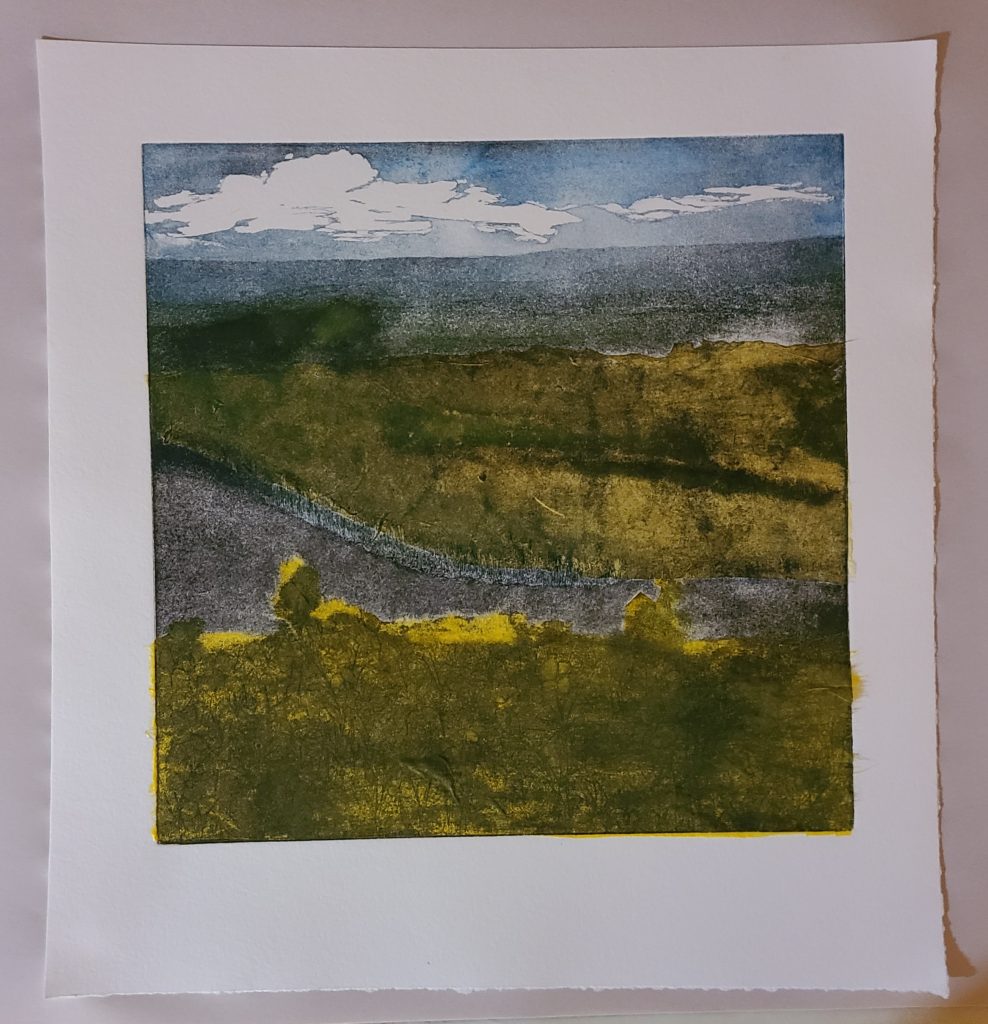
Print 2/100 is done on 140lbs BeeCompany paper. It is made with black, blue, and yellow Cranfield Ink as well as specialty yellow paper.
Print 2/100 , I used both methods of, A la Poupee and Chin Cole to make this print.
Print 3/100 is done on moist, specialty yellow paper with dry, specialty brown paper added for the Chin Cole.
Print 3/100. This print is done on yellow specialtiy paper and has both , A la Poupee and Chin Cole.
Print 4/100 is done on dry massa paper with the black and yellow Cranfireld Ink.
Print 4/100. This print is done on dry massa paper , with the A la Poupee printing process.
Print 5/100 is done on wet, 140lbs BeeCompany paper with black, blue, and yellow Cranfield Ink.
Print 5/100. This last print is the A la Poupee method.
I have chosen to make this a series of one hundred because I think I have only begun to touch upon what I can accomplish with this plate. I will continue to explore A la Poupee, Chin Cole, as well as trying Viscosity. I look forward to more time with the printing process involving copper plates as well as other surfaces.
Francisco Jose de Goya y Lucientes, was a Spanish painter and print maker. He was born on 30th of March 1746, and died 16th of April 1828. Goya is considered one of the most important Spanish artist of his time, in part because he used his long career to chronicle his era. Goya was born in Fuendetodos Aragon, to a lower-middle-class family. He began painting at age 14 and moved to Madrid to study under Anton Raphael Mengs. He married Josefa Bayeu in 1773 and they lost many children to miscarriage but did have a son grow to adulthood. Goya is known for his skills of portraiture and in 1786 he became court painter to the Spanish Crown. In 1793 Goya suffered a severe undiagnosed illness which left him deaf and his work became progressively darker and pessimistic. In 1795 Goya became the Director of the Royal Academy. 1799 saw Goya appointed Prime Court Painter which is the highest ranking Spanish Court painter.
The year 1807 brought Napoleon into the Peninsular War against Spain and although Goya didn’t speak his thoughts in public, they were inferred through his artwork. At the age of 62 Goya began his production of “Disasters of War” series of prints . He also painted “The Third of May” (along with others). Goya made so many paintings and prints during this time it was said he acted like a photographic chronometer. It is said also that the imagery in his work show his concern for insanity, mental asylums, witches, and fantastical creatures, depict Goya’s concern with religious and political corruption.
The later part of Goya’s life was spent in near isolation. He painted some very disturbing images on the walls of his house. The “Black Paintings” consisted of 14 murals. In 1824, Francisco Goya retired to Bordeaux, France where he completed his “La Tauromaquia” (and more ). Goya suffered a stroke which left him paralyzed on his right side, he had failing eyesight and poor access to painting materials. He died in 1828 at 82 , and when his body was returned to Madrid, famously, his skull was missing.
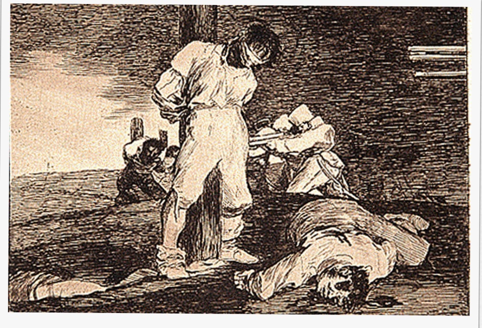
“And There’s Nothing To Be Done” 1810 Etching, drypoint, burin, burnisher Plate #15 of The Disasters of War Series 14×16.7cm (The Metropolitan Museum of Art)
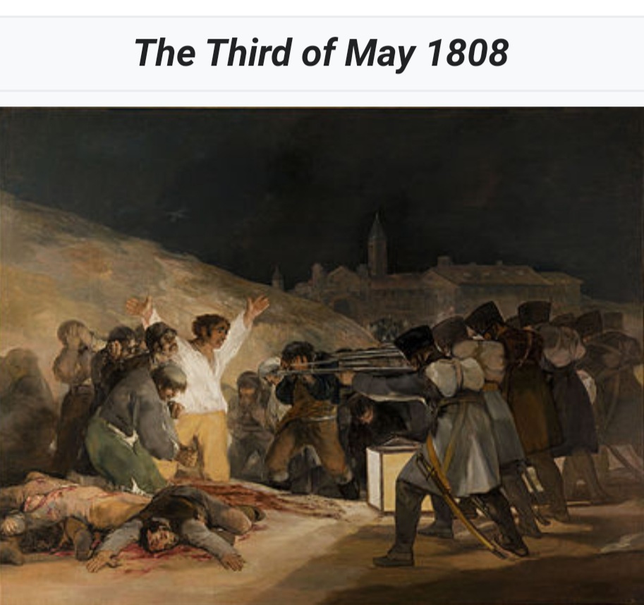
The “Disasters of War” series where Goya’s way of visually depicting the French occupation of Spain. This plate coincides with Goya’s painting, “The Third of May” which I find to be very similar.
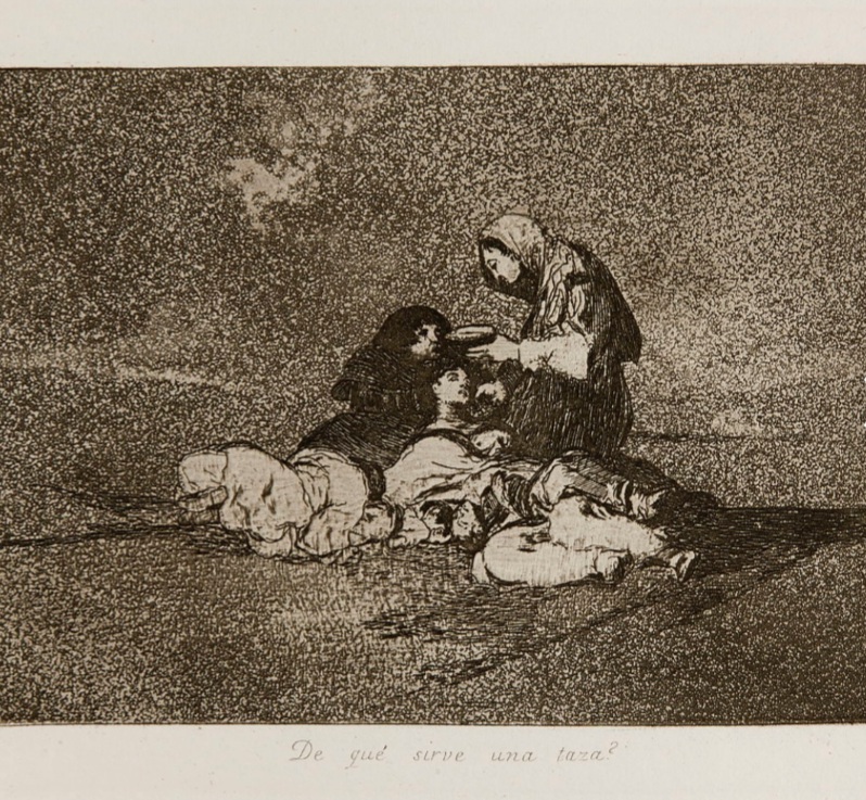
“What Is The Use of A Cup” Etching, Aquatint, Lavis, and Bunisher with plate tone on wove paper Plate # 59 The Disasters of War Series. 12.54×17.94 cm (4 15/16 x 7 1/16 “)
I like the pitting of the background in this plate. The total tonal scale is very visually pleasing.
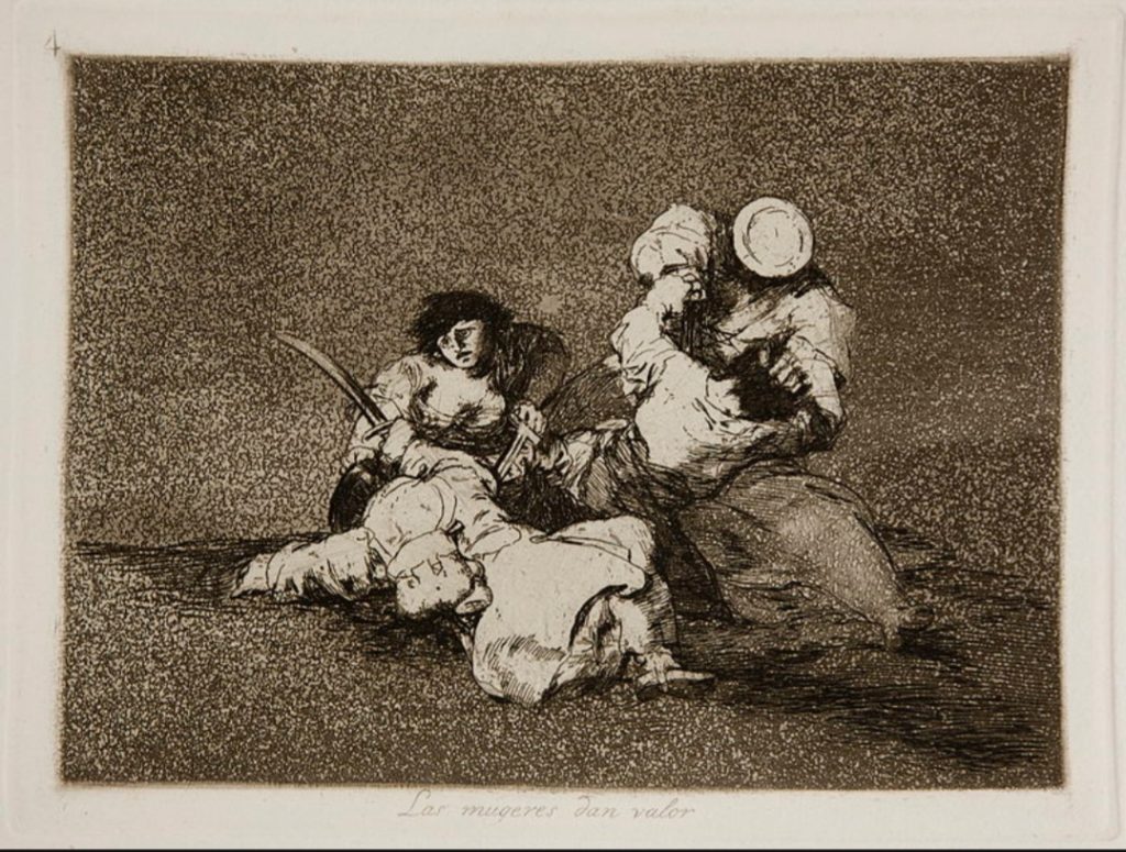
“The Women Give Courage” Etching, aquatint, lavis, dry-point, burnish,with tone on wove paper Plate #4 The Disasters of War Series 15.3 x 20.4 cm (6 x 8 1/16′)
The background again is very interesting but I also enjoy the light/dark contrast in this plate.
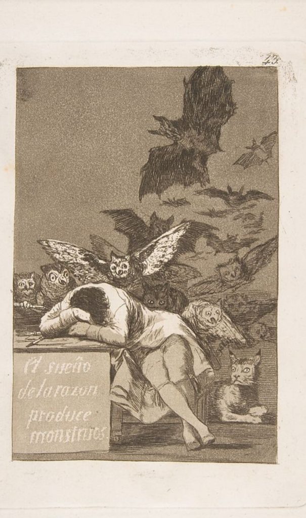
“The Sleep of Reason Produces Monsters” Etching, aquatint, drypoint, and burin Plate#43 The Disasters of War Series 27.3 x 19.5 cm ( 10 3/4 x 7 1/5 “)
This plate has many tonal values. The fantastical beasts give a excellent depiction of the mental state of men.
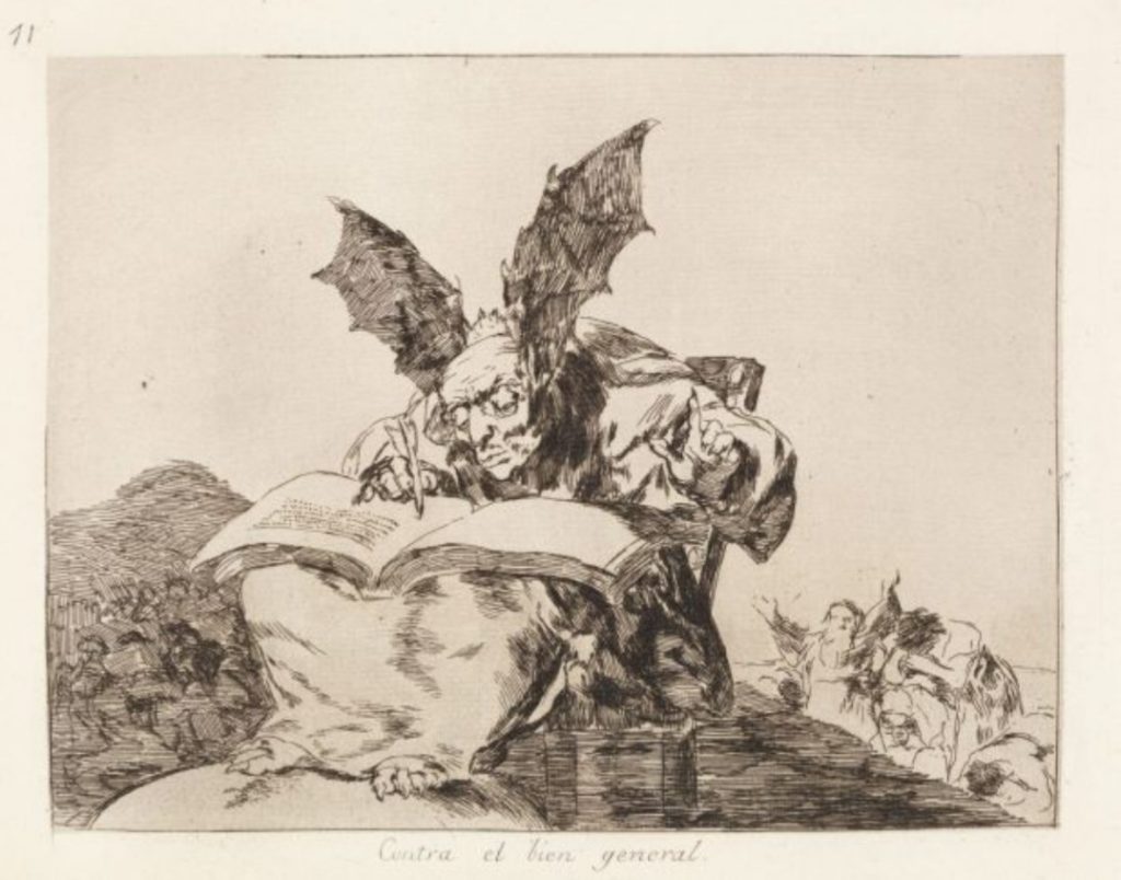
“Against The Common Good” Etching, burnisher, aquatint Plate #71 The Disaster of War Series 14.92 x 19.05 cm ( 5 7/8 x 7 1/5″)
I picked this plate simply for the imagery. To me, it speaks volumes. Goya was quite deaf at this time. Was he trying to hear the cries of the people of Spain over the voices in his head?
Francisco Goya and Kathe Kollwitz are both artist that used their art as a sort of voice for the common people. They both chose to depict the atrocities of war, and the abuse of the hierarchy on the common people. Goya chose to use images more from imagination and Kollwitz was more focused on reality and wars affect on women. They both used many different mediums, but I am focusing on their prints.
Kathe Kollwitz was born, 8th July 1867 in Konigsberg, Prussia. She was a German Expressionist whom I admire very much. Both her father, and her grandfather, a pastor, had very big influences on her. Kathe began drawing lessons when she was twelve. At age sixteen, Kathe enrolled into a school for women in Berlin. While there, she met Max Klinger, whose etching techniques and social concerns were an inspiration to her. At seventeen, Kathe, while studying in Munich met Karl Kollwitz who was studying to be a doctor. They married in 1891 and lived in a large apartment Berlin until it was destroyed in WWll. She had two sons, Hans 1892 and Peter 1896. Peter was killed in WW1 in 1914 which began a stage of prolonged depression in Kathe’s life.
The mid-1930 Kollwitz completed her last major cycle of lithographs, known as the” Death Cycle.” In 1933 the “Nazi Party” forced her to resign her place on the faculty of the Akademie der Kunste and her work was removed from museums. She was banned from exhibiting but one of her works, a sculpture, “Mother with her Dead Son” was used by the Nazis for propaganda. Today this piece is in ” The New Gaurdhouse”. The New Guardhouse is located at Unter den Linden boulevard in the Mitte district, is the Central Memorial of the Federal Republic of Germany for the Victims of War and Dictatorship.
In 1943 Kathe was evacuated from Berlin. Kollwitz died sixteen days before the end of WWll.
The subjects of Kollwitz’s art were mainly figurative and revolved around middle-class life. She found the working class had grit and she found it beautiful. She produced a cycle of six works on the weavers theme, three lithographs and three etchings with aquatint and sandpaper. The works were a naturalistic expression of the workers’ misery, hope, courage, and eventual doom.
The Weaver Series was considered by Kollwitz to be her most popular work during her lifetime and she was to win a medal from the Great Berlin Art Exhibition in 1898. Unfortunately the Kaiser Wilhelm ll refused to issue a metal to a women.
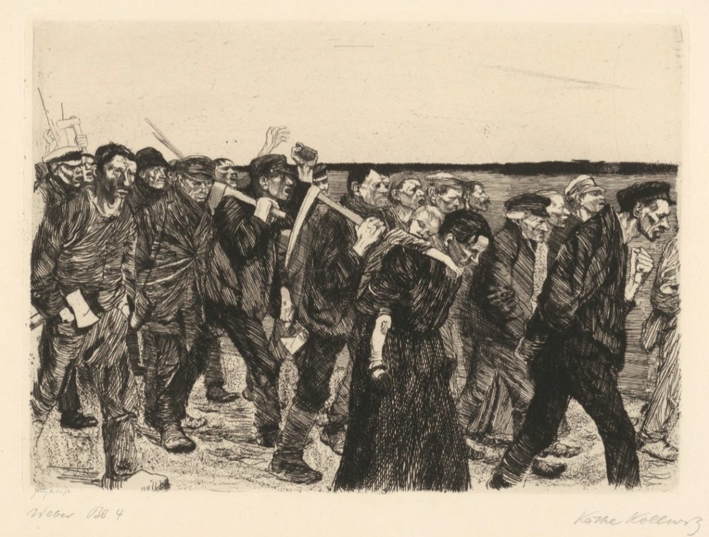
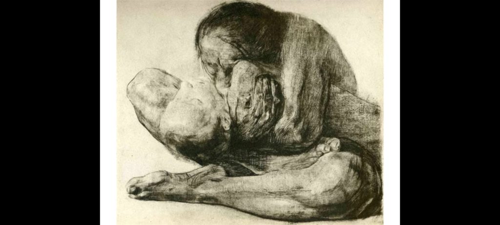
March of the Weavers Series 1893-1897, sheet 4 of “A Weaver’s Revolt. Line etching and sandpaper
I am drawn to the light top and dark bottom focus of this piece. The single women with the child on her back equals the strife of all the men she walks with. I say that because it is how I feel when I view this image.
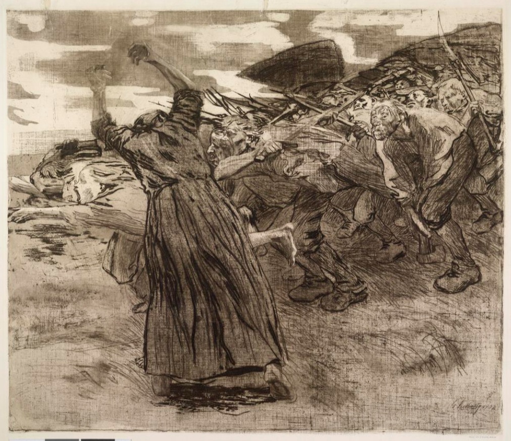
The Peasants’ War Series “Outbreak” 1902 Plate #5 line etching, drypoint, reservage and soft ground with imprint of two fabrics and Ziegler’s transfer paper. 19 x 22 7/8″
The Peasant’s War Series was the second major cycle of works for Kollwitz. She worked on the series for six years. “Outbreak” was awarded the Villa Romana prize which provided a year’s stay in 1907 in a studio in Florence.
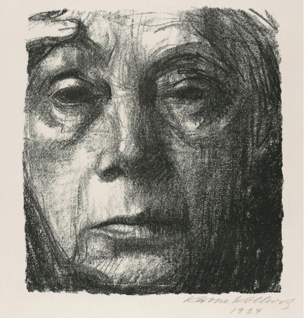
Death Series Sheet 4 a woman 1934 crayon lithograph 50.7 x 36.8 cm (19 15/16 x 14 1/2 “)
This print has been one of my favorite images for many years. Now that I know what a lithograph is I appreciate it even more. The amount of expression that can be portrayed with very few lines is most impressive.
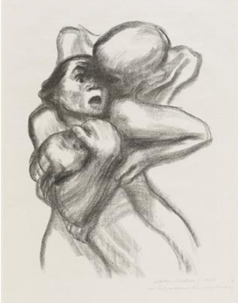
Woman with Dead Child 1903 Etching with chine colle 41.2 x 47.1 cm (16 1/4 x 18 9/16″)
Kathe Kollwitz used herself and her seven year old son Peter to poss for this etching. The pain of holding a child while looking in a mirror the draw this must have been excruciating and it shows.
Self – portrait 1934 lithograph on wove paper 37.4 x 26.9 cm (8 1/2 x 7 3/8″)
Self portraits were important to Kollwitz and she is known to have made fifty of them. I believe she did them to record her passage of time on this earth.
Kathe Kollwitz and Francis Goya both used the full spectrum of light/dark in their images
the line work is easily followed in these compositions.
the mother and child depicted in Kathe’s ” Woman With Dead Child” seem to convey the same sense of foreground and background as portrayed in Goya’s “Against The Common Good” .
both images depict a sense of the hardship endured by the common people through their respective wars
both artists used print making as a way of commentary for social and political issues of their time.
By comparing and contrasting Francis Goya and Kathe Kolltwiz, I realize that I am interested in their works because of the drawing line quality in their prints. The subject matter and representation of images to convey their views is visually pleasing to me as well.
Resources:
Hughes, Robert (2003). Goya.
Fick, Bill & Grobowski, Beth (2009) Printmaking A Complete Guide To Materials & Processes
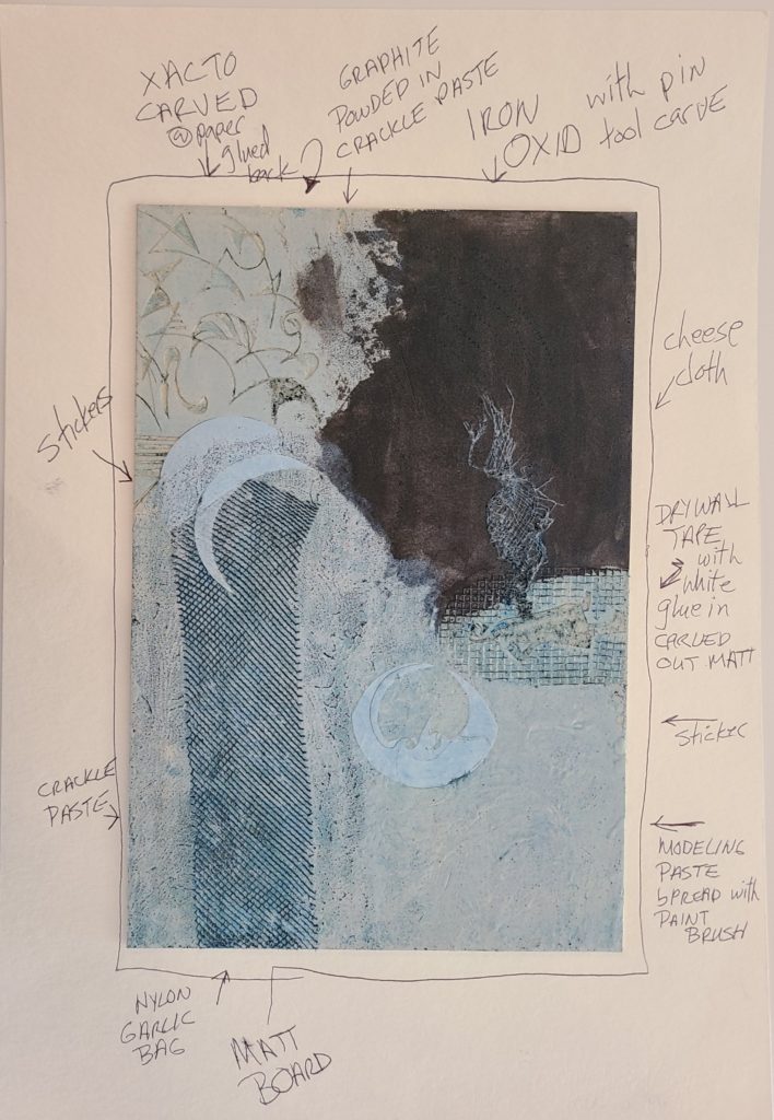
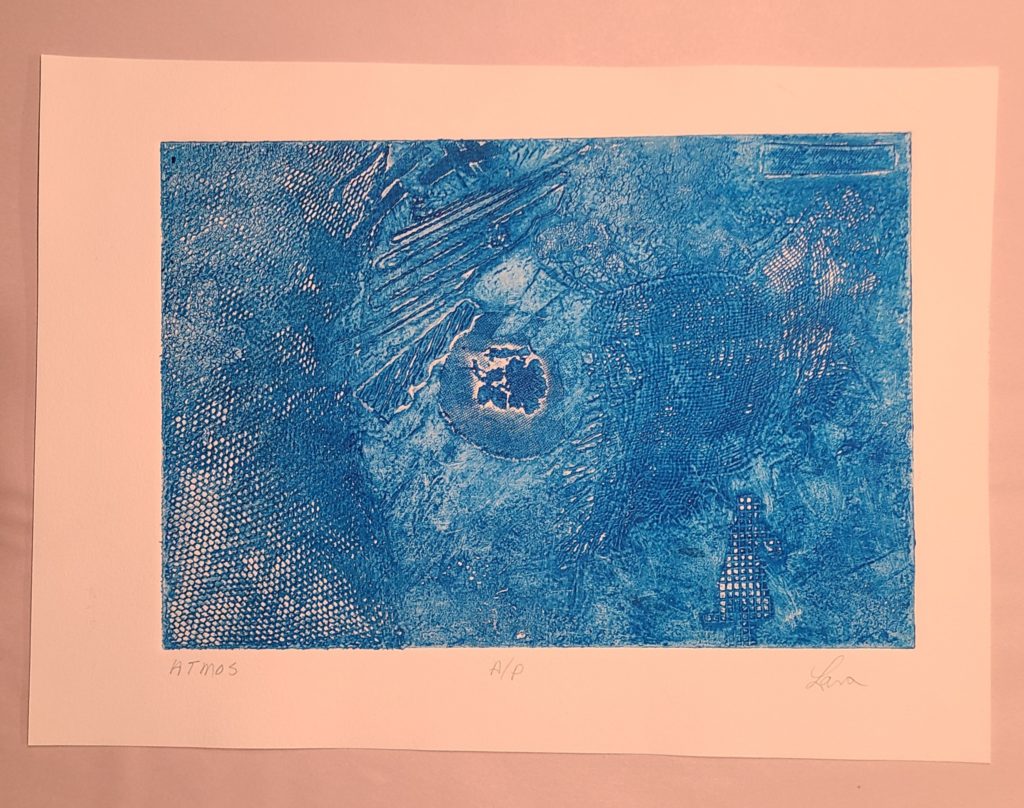
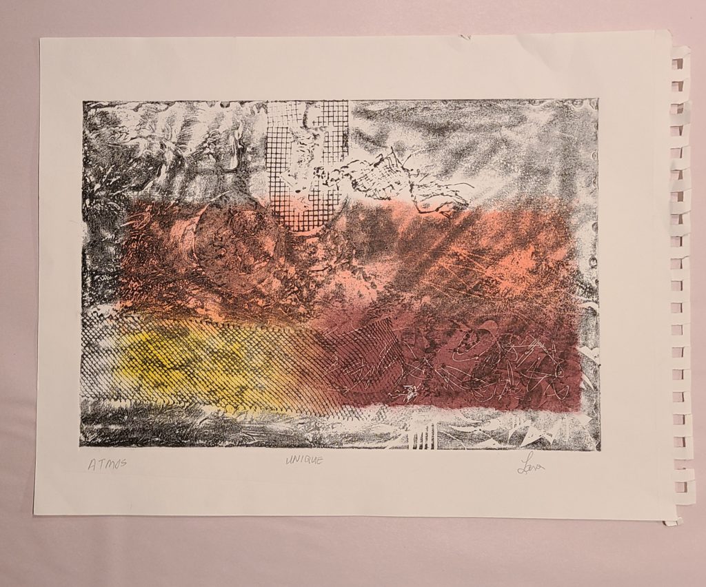
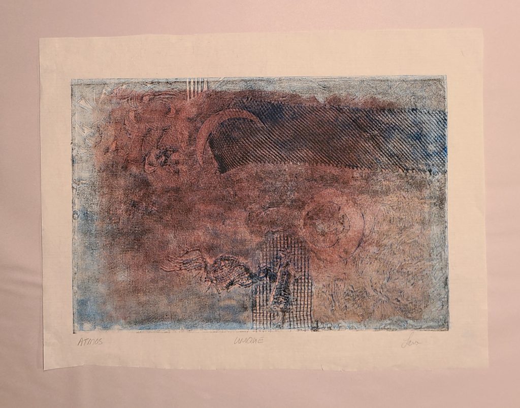
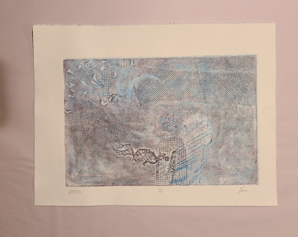
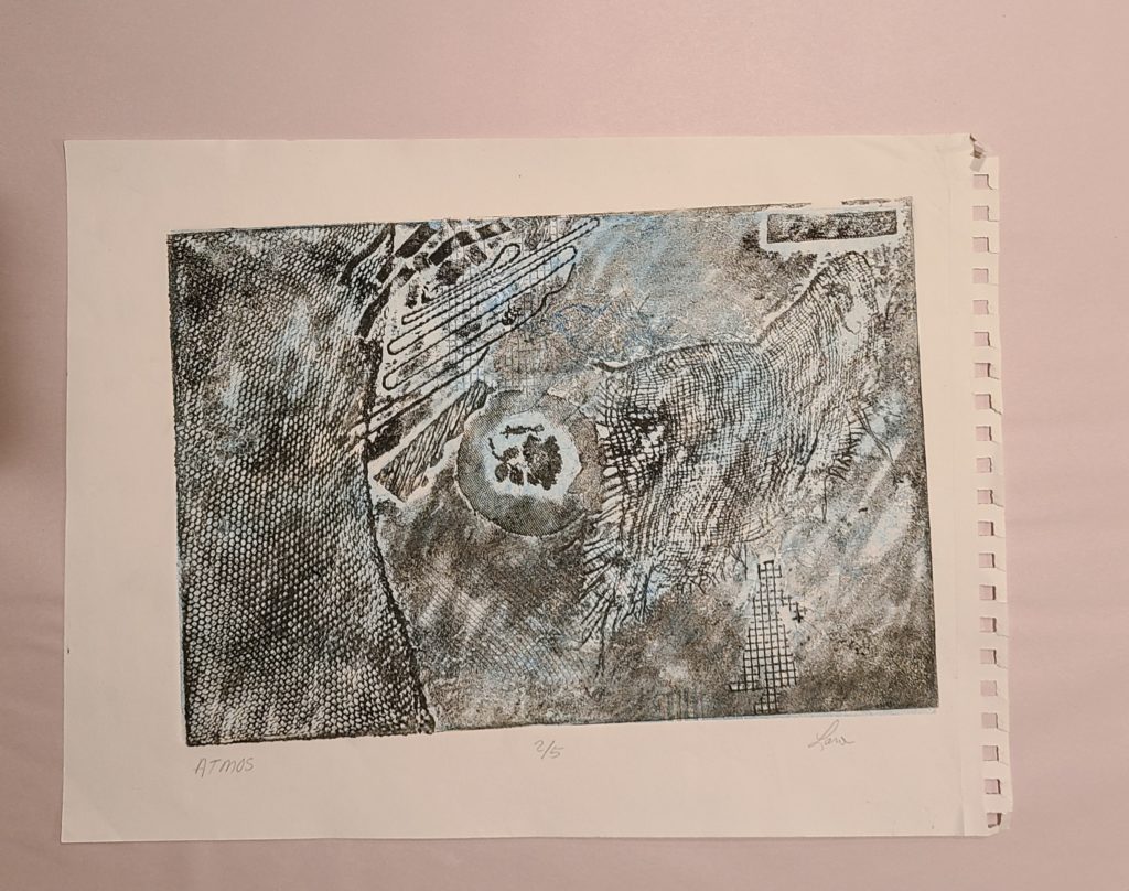
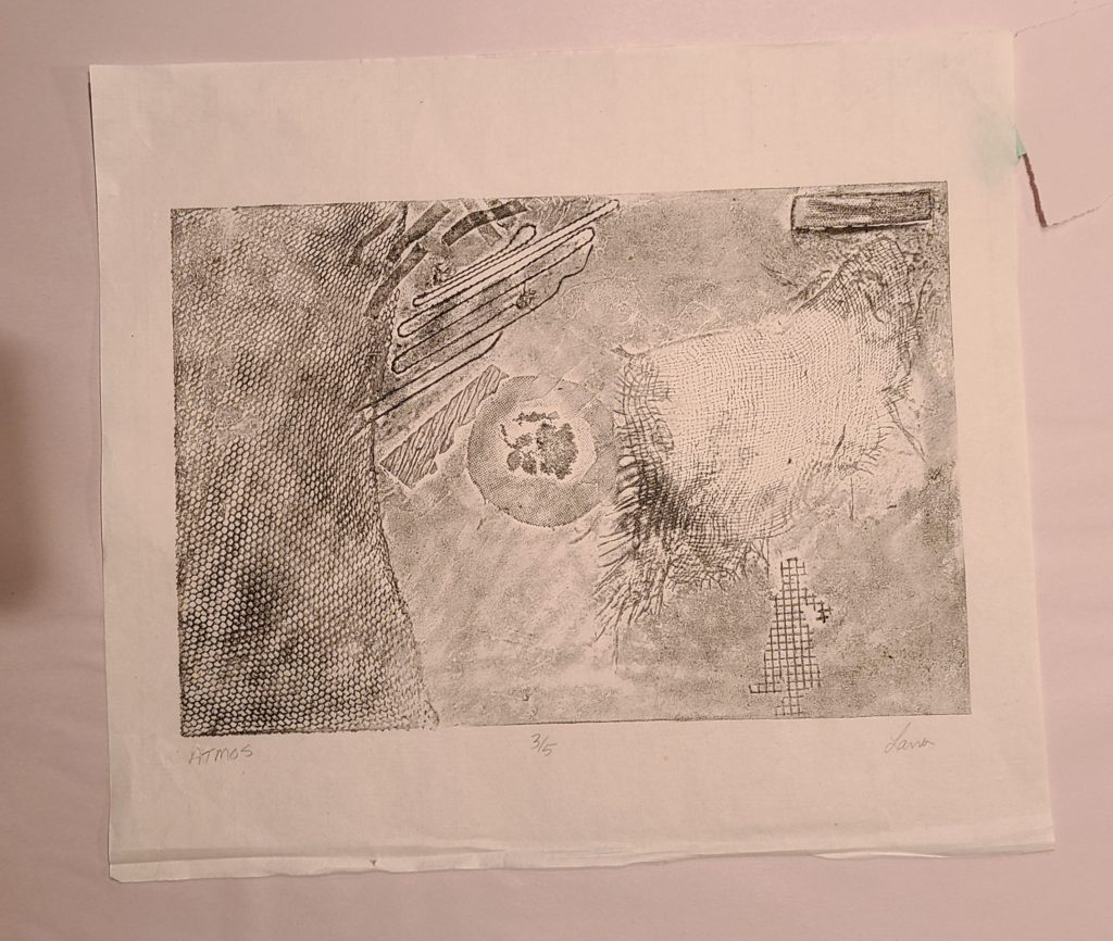
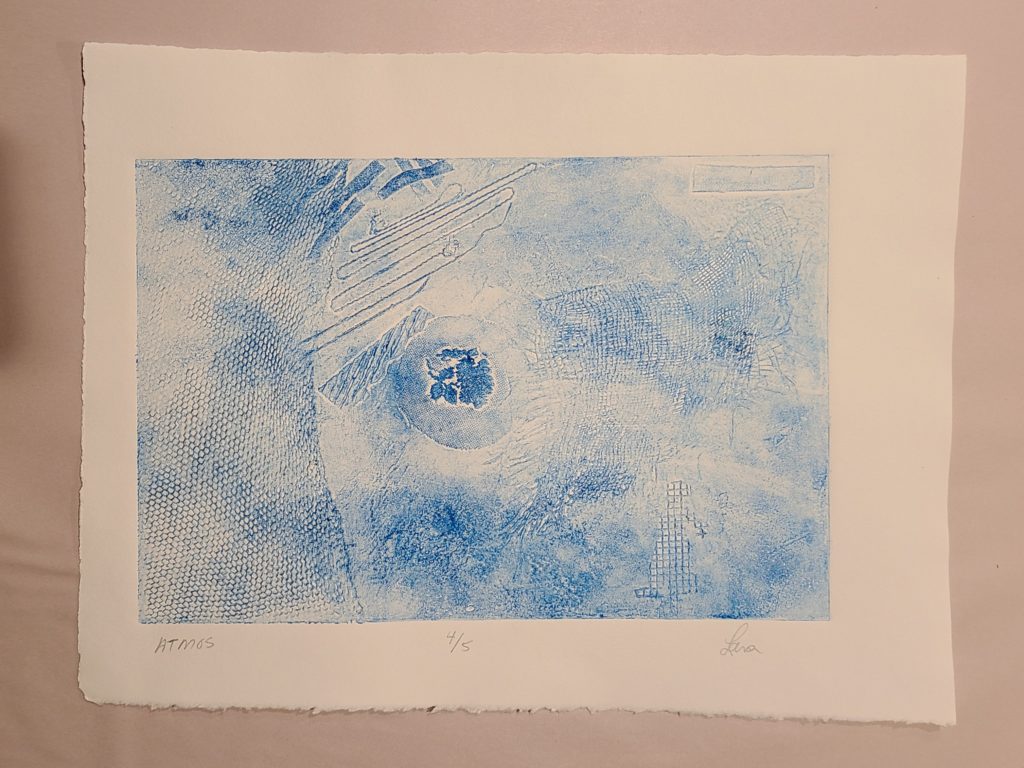
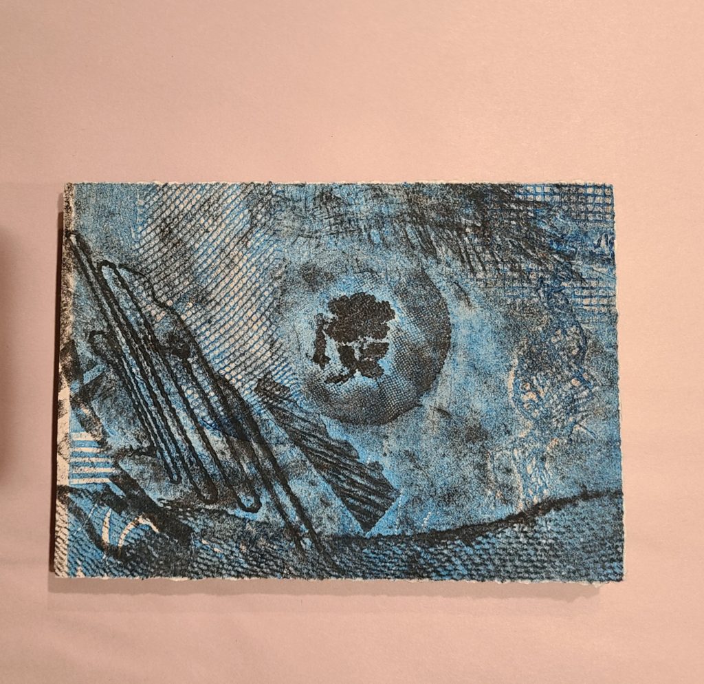
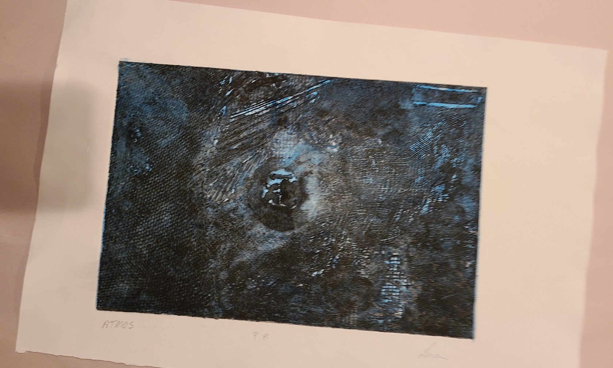
This project was based on the theme of “Atmosphere”
I chose the theme,”Atmosphere” because, to construct my plates I used both smooth and rough textures as well as relief and layering. I incorporated both abstract and representational images to see if the composition would develop an atmospheric quality or if it would appear as strictly abstract.
Collagraph Plate one/ two
blue cranfield ink with extender hand pressed with spoon and glass frog
Bee Paper Company Watercolour 140 lb cold press
This print was hand pressed with black cranfield ink mixed with extender and tac wipe. A spoon was used as well as a glass frog. It was later coloured with viscosity technique and run through a small press.
mono print on sketchbook paper 70 lb
this print was hand pressed twice and later colour was added with viscosity technique run through small press
rice paper with black cranfield plate 1 blue cranfield plate 2 viscosity colour
This print is 1/5
plate 1 is black cranfield ink ghost
plate 2 is blue cranfield . Both are hand pressed as before.
Stonehedge watercolour paper 140 lb wet and re wet
2/5 Plate 1 is black cranfield ink with extender and tac wipe
Plate 2 is blue cranfield ink with extender and tac wipe ghosted
70 lb sketchbook paper
3/5 This print is black cranfield with extender and tac wipe , wet and re wet hand pressed with spoon as well as glass frog.
rice paper
Print 4/5
blue cranfield ink with extender and tac wipe, wet and re wet , hand pressed as before.
Bee company watercolour paper 140 lb
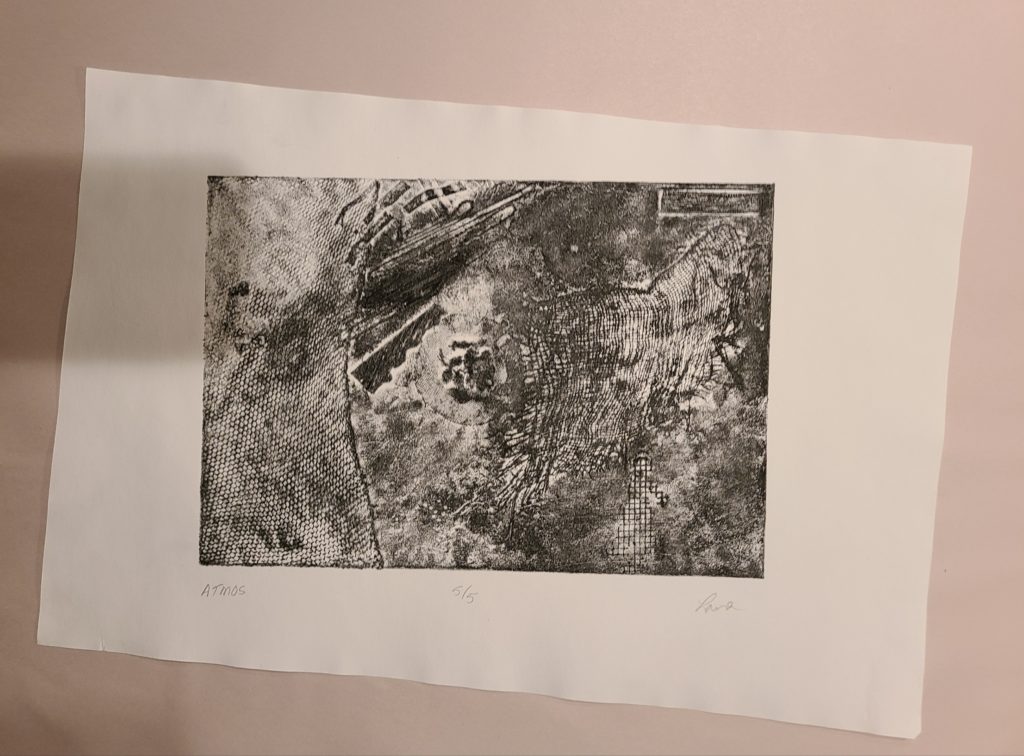
5/5
black cranfield ink with extender and tac wipe , wet and re wet , hand pressed with spoon and frog.
140 lb stonehedge
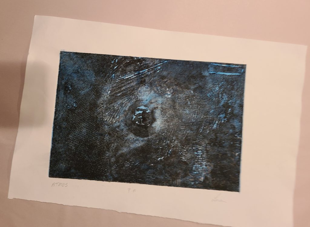
I included this print because I like the different look with the dark ink
140 lb stonghedge
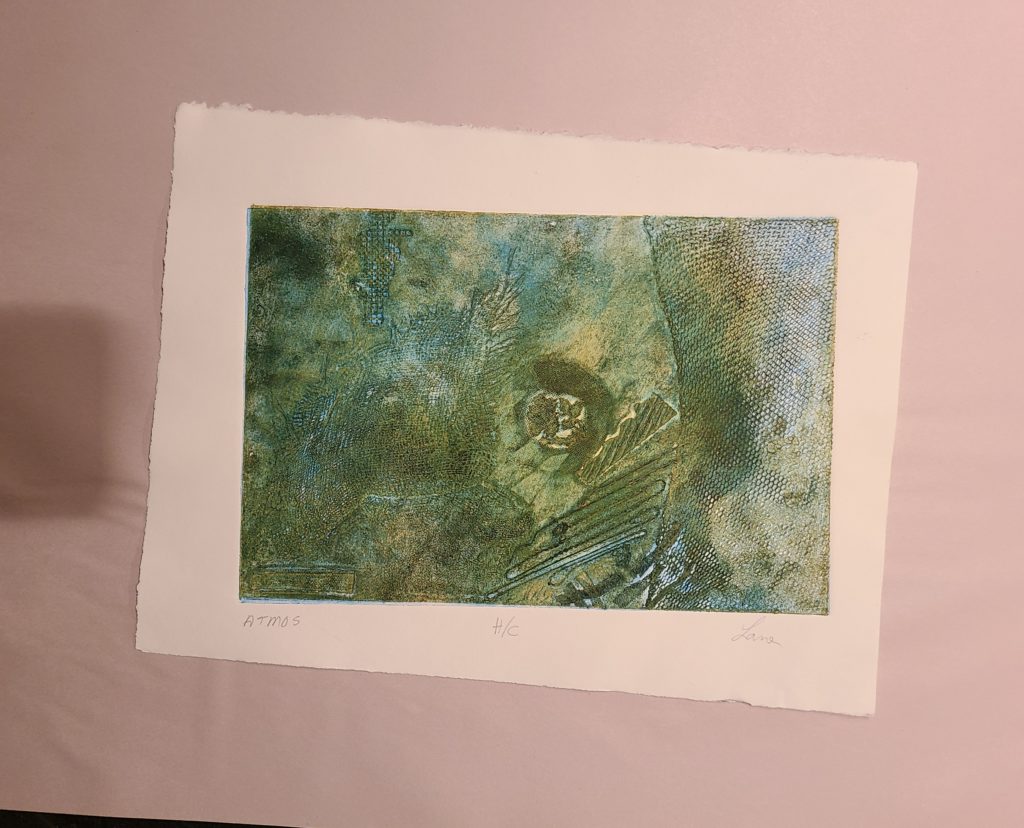
H/C ,also included because it is wet and re wet many times with many colours and is one of my favorites.
140 lb stonehedge
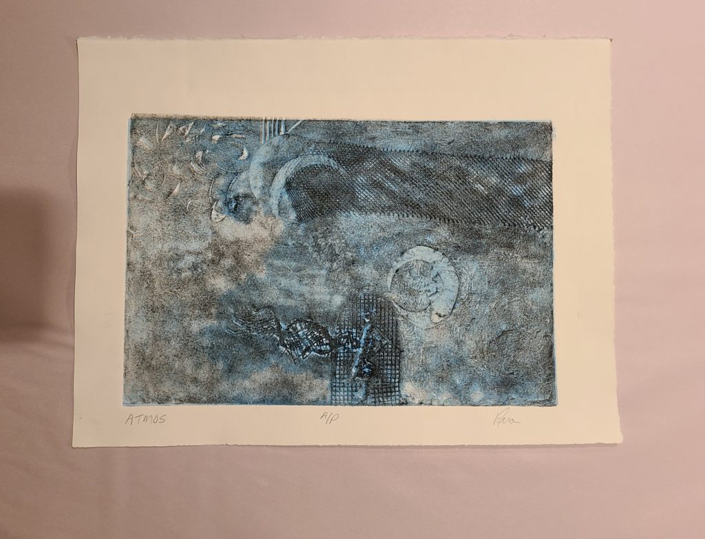
A/P
Because I really , really like it.
140 lb stonehedge
Fun little exparament with a cut print and a 5×7 canvas. Thanks Terri.